
Call to Action Generator: How to Write CTAs That Convert
A page with one clear call to action converts at 13.5%, compared with 10.5% when it presents five or more CTAs, according to an Unbounce analysis of 18,639 landing pages summarized by Foundry CRO's CTA benchmark. That gap reframes the call to action generator. Its job isn't to fill a page with clever buttons. It's to help you choose one relevant next step, express its value clearly, and produce disciplined variants you can test.
The strongest workflow treats CTA generation as prompt engineering plus conversion research. You define the channel, audience, funnel stage, commitment level, brand voice, and measurement plan before asking for copy. Then you constrain the output for the screen where it will appear, remove vague language, and test wording without changing five other variables at the same time.
Table of Contents
- What a Call to Action Generator Actually Does
- Defining the Inputs Before You Generate
- Prompt Templates That Produce Ten Variants
- Constraints That Make CTAs Channel-Ready
- Why Small Wording Changes Beat Visual Redesigns
- Testing and Measuring Your Generated CTAs
- Integrating Winning CTAs and Next Steps
What a Call to Action Generator Actually Does
A useful call to action generator turns a conversion brief into controlled copy variations. It produces more than just a list of catchy buttons. It connects the intended action with the channel, commitment level, mobile context, and measurement plan, then gives you options that can be tested without changing the whole page.
CTA count also makes this a choice-architecture problem. Pages with one CTA converted at 13.5%, compared with 10.5% for pages showing five or more, a relative difference of about 22%, according to the Unbounce landing-page analysis. Extra buttons can force visitors to decide which action matters. That decision adds friction when the page should be directing momentum toward one next step.
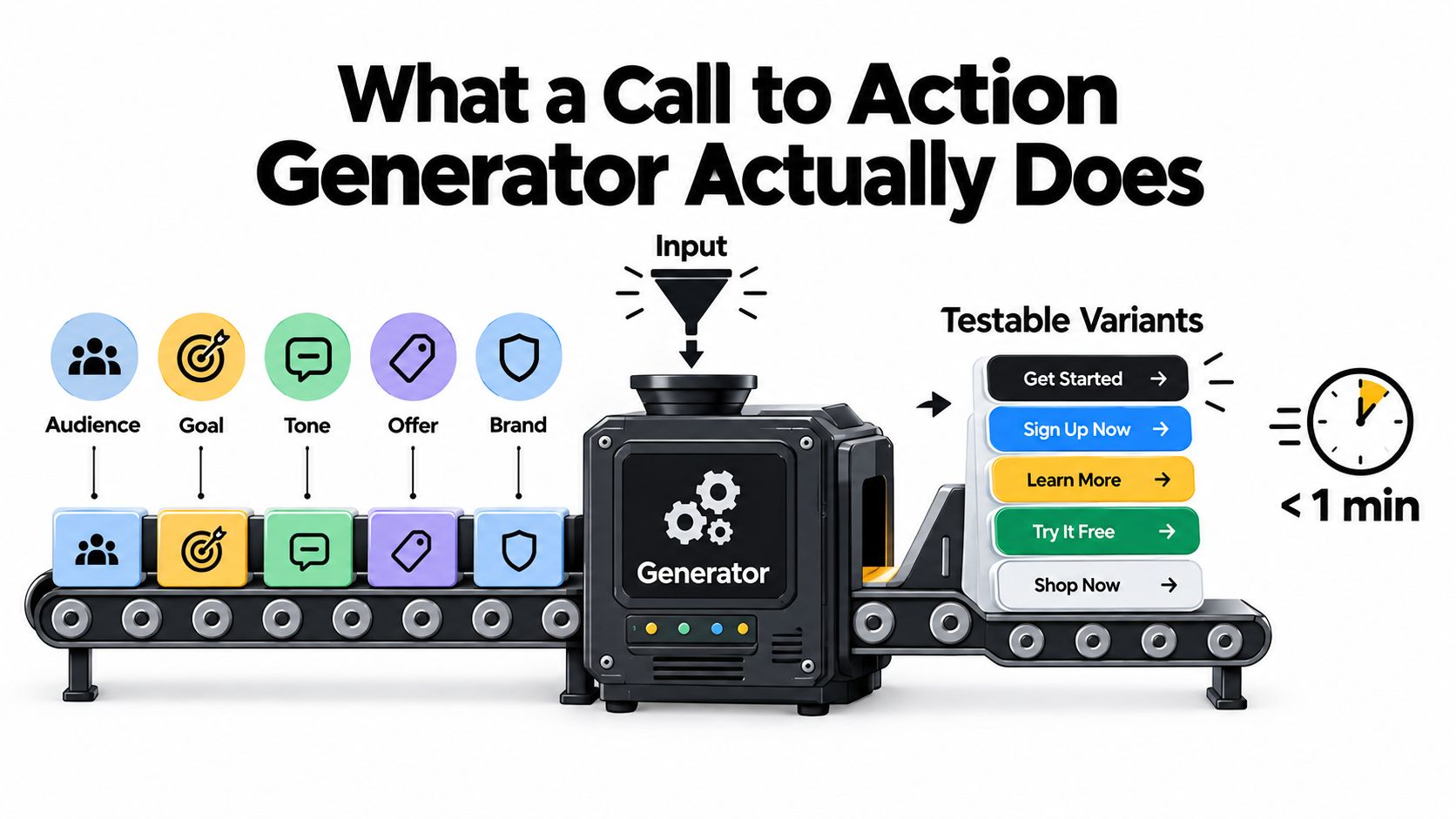
The four jobs behind the output
A generator earns its place in the workflow when it handles four jobs:
- Translate intent into action: Awareness-stage copy might say “See how it works,” while decision-stage copy could say “Start my trial.” The verb must match the reader's readiness.
- Match commitment with risk language: “Buy now,” “Book a demo,” and “Download the guide” create different expectations. Supporting copy should clarify the effort, cost, or obligation.
- Calibrate for the channel: A landing-page hero can rely on nearby proof and reassurance. An email CTA must work for a reader skimming the message. A social CTA needs to fit the platform's reading behavior.
- Survive the mobile scan: Short wording, clear value, sufficient contrast, and one obvious tap matter more on a small screen. Generate mobile-specific options instead of shortening desktop copy after the fact.
The production sequence is practical: define the brief, select a prompt structure, add channel constraints, generate variants, test one meaningful change, and implement the winner. For broader prompt patterns, this guide to an AI marketing copy generator offers relevant context for structuring marketing inputs.
A weak brief produces weak options. The generator cannot decide what the visitor needs, what action the business wants, or which objection blocks progress unless those decisions appear in the prompt. Fix that input before changing button color or requesting another batch of slogans.
The surrounding experience still affects the result. A persuasive button can fail if the page loads slowly or the form demands unnecessary work. Use this page speed and form tactics for more guidance alongside CTA work, particularly when the generated copy promises a quick or simple next step.
Defining the Inputs Before You Generate
Generic prompts produce generic CTAs because they omit the decisions a conversion copywriter makes instinctively. Put those decisions into the input block before generation.
Start with channel. “Write a CTA” gives the model no reason to distinguish a paid-ad button from a landing-page hero or a social caption. A stronger instruction says: “Write a CTA for Facebook ad primary text below a 125-character headline, mobile-first.” The channel controls how much context can surround the action and how quickly the reader needs to understand it.
Next, specify the funnel stage. Awareness copy can invite someone to learn or explore. Consideration copy can help them compare or inspect proof. Decision copy can ask them to start, book, or purchase. Then identify the audience, including its awareness level and main objection. “Small-business owners worried about setup time” produces a more useful brief than “business owners.”
The fourth input is commitment level. A free resource, trial, consultation, and purchase each need different risk framing. Finally, define the brand voice. Tell the generator whether to use first-person language, a direct command, restrained urgency, informal wording, or a formal tone.
| Input | What It Controls | Example Value | What to Log |
|---|---|---|---|
| Channel | Length, context, and verb density | Mobile-first paid ad | Placement and device |
| Funnel stage | The reader's likely readiness | Consideration | Stage and traffic source |
| Audience | Relevance and objection handling | Time-poor operations leads | Segment and objection |
| Commitment level | Risk, effort, and reassurance | Free trial | Click and downstream signup |
| Brand voice | Pronouns, urgency, and formality | Direct, calm, first person | Variant style and approval notes |
Build one complete prompt block
Use a single instruction such as:
You're writing for time-poor operations leads at the consideration stage. The channel is a mobile-first landing-page hero. The desired action is to compare workflow tools, not request a sales call. Use a calm, direct voice with first-person phrasing where natural. Produce ten variants, explain the value in plain language, and avoid “submit,” “learn more,” “revolutionary,” and unsupported urgency.
Each input should connect to something you can log. Record the channel, stage, segment, commitment, exact variant, click metric, and downstream outcome. If you want deeper guidance on turning these fields into repeatable instructions, use this resource on prompt engineering for marketing.
The practical benefit is fewer revision loops. The generator isn't making the strategic decision for you. It's receiving enough information to make the first draft closer to the decision you already understand.
Prompt Templates That Produce Ten Variants
Ten variants help only when each one tests a different conversion idea. A request for “ten creative CTAs” usually produces one sentence with interchangeable adjectives. Build the prompt around a defined role, fixed output count, distinct decision angles, and explicit exclusions. The generator should produce testable options, not decorate a decision that has not been made.
Paid ads
You're a performance copywriter. Create ten CTA options for a mobile-first paid ad promoting [offer] to [audience] at the [funnel stage]. Keep each CTA verb-first and under eight words. Provide two urgency variants, two low-pressure variants, three benefit-led variants, and three clarity-led variants. Use only these verb families: start, compare, see, get, try, book. Number the options. Avoid “click here,” “submit,” vague hype, and claims not supported by the offer.
The role assignment sets the copy standard. Numbering keeps commentary separate from the options. The category split creates deliberate variation, while the exclusion list removes familiar filler and unsupported promises.
Act as an email conversion copywriter. For [audience] and [offer], write ten primary CTA variants for the message body, plus one short subject-line action and one preview-text reinforcement for each. Keep body CTAs between four and seven words. Include first-person options, benefit-led options, and low-commitment options. Add a plain-text fallback for every button CTA. Avoid “learn more,” “submit,” and urgency unless the email contains a real deadline.
Email needs its own prompt because a button and a plain-text link appear in different reading contexts. Prospeo's email CTA benchmark reports that button CTAs outperformed text links by 28% to 127% in observed tests, and presents campaign CTR below 1.69% as a signal to inspect the CTA first. Treat those figures as directional benchmarks, not a forecast for your audience.
Landing pages
You're a landing-page CRO specialist. Create ten CTA systems for [offer] and [audience]. For each system, provide a hero button, sticky-navigation button, and exit-intent alternative. Match each action to the visitor's [commitment level]. Add one reassurance line that addresses [objection]. Keep the hero copy concise, make the action specific, and use different verbs across the set. Avoid generic labels and claims not stated in the source brief.
This template produces a coordinated action system instead of disconnected button ideas. It also gives hesitant and high-intent visitors different paths without assuming they share the same objections or readiness.
Social
Act as a social conversion copywriter. Produce ten hook-and-CTA pairs for [platform], aimed at [audience] in the [funnel stage]. Calibrate the format to the platform: long-form professional context for LinkedIn, concise profile language for Instagram, and reply-ready brevity for X. Give each pair one primary action only. Include five low-friction asks and five next-step asks. Avoid multiple requests in one CTA, engagement bait, and unsupported urgency.
Use the Prompt Builder's marketing prompt library to organize reusable templates and structured instructions. The principle is simple: the prompt structure determines the quality ceiling. A stronger model cannot compensate for missing channel, audience, commitment, or output constraints. Log each generated variant with its intended action and later performance, so the next prompt reflects evidence rather than preference.
Constraints That Make CTAs Channel-Ready
A generated CTA becomes shippable when it fits the environment without losing the action. Constraints aren't creative restrictions. They're the specifications that stop good copy from breaking inside a button, wrapping awkwardly on a phone, or asking for too much too soon.
Start with length. Paid-ad buttons generally need very short wording, landing-page CTAs can carry more context, and email buttons often work best when they stay compact. Treat these as starting constraints, then validate them against the actual interface and device rather than treating any character rule as universal.
| Channel | Character Limit | Phrasing Style | Mobile Rule |
|---|---|---|---|
| Paid ad button | Keep it brief | Verb first, direct benefit | Use one obvious tap target |
| Landing-page hero | Allow supporting context | Specific action plus reassurance | Preserve readable spacing |
| Compact button phrase | First person or clear command | Make the button easy to scan | |
| Social caption | Action tied to the post | Low-friction and channel-native | Keep the ask visible before truncation |
Design for the thumb, not the desktop mockup
A mobile-ready CTA needs a legible label, sufficient whitespace, strong contrast, and placement where the thumb can reach it comfortably. Avoid dropdown-trigger actions when a direct destination will do. Don't make the user interpret an icon, open a menu, and then choose again.
The copy also has to reflect who is acting. First-person phrasing such as “Start my trial” lets the reader imagine ownership. Command phrasing such as “Start your trial” speaks from the brand toward the user. Test the distinction rather than treating one as a permanent rule. The observed case study from Wisevu's CTA button text test reported average CTRs of 2.06% for “GET A QUOTE,” 2.10% for “FREE ESTIMATE,” 2.12% for “GET PRICE,” and 2.31% for “FREE QUOTE.” The copy changed while layout and offer stayed constant, illustrating why semantic framing deserves its own test.
Use urgency only when it carries information
Words such as “today” and “now” can clarify timing when a real deadline or availability limit exists. Without a genuine reason, urgency becomes padding and can reduce trust. Your constraint block should state whether urgency is allowed, what evidence supports it, and which words are banned.
Constraint block: Write for a mobile landing-page hero. Keep the button concise, use a direct but calm voice, name the immediate benefit, and include one reassurance line. Create first-person and command variants. Ban “submit,” “click here,” “revolutionary,” and artificial urgency. Return ten options in a numbered list.
Why Small Wording Changes Beat Visual Redesigns
A CTA can gain a 0.25 percentage-point difference from wording alone. In the controlled case study cited by Wisevu, “FREE QUOTE” reached a 2.31% average CTR, compared with 2.06% for “GET A QUOTE,” while the layout and offer stayed unchanged. The result is not a universal forecast. It shows why a prompt should isolate the proposition before asking a team to rebuild the component.
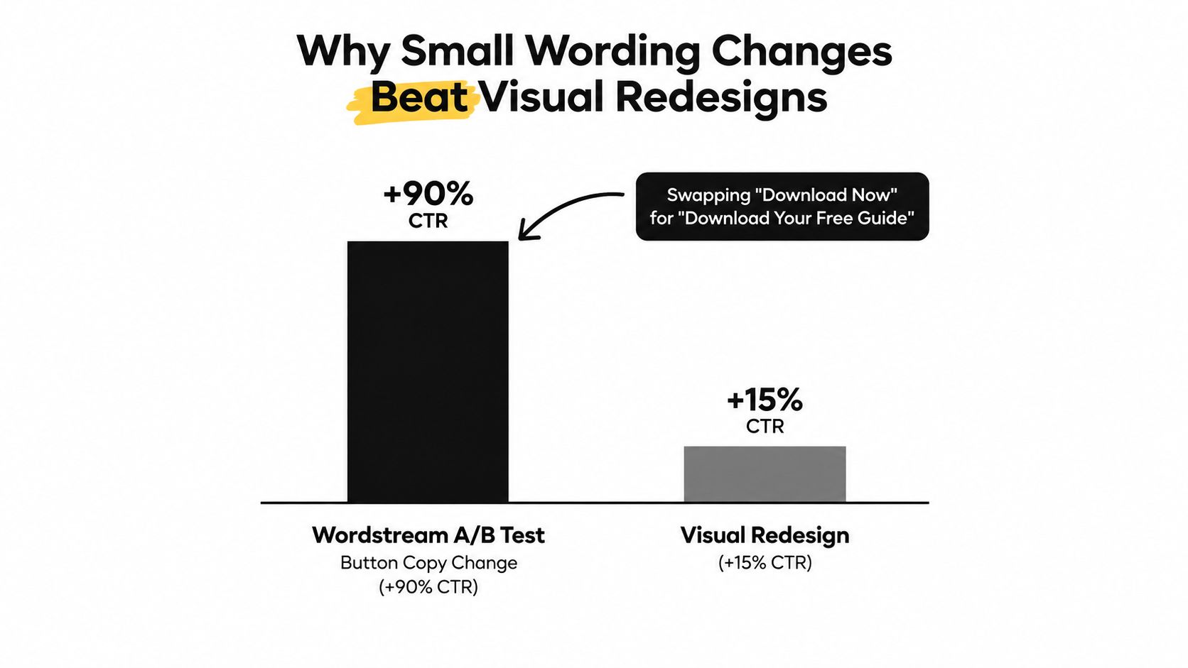
Three wording levers
- Specificity: “Get pricing” gives more direction than “Continue.” “Get my free estimate” adds both a clear outcome and ownership.
- Ownership: “Start my trial” can feel more personal than a brand-directed command. Generate and compare it with “Start your trial.”
- Risk reversal: “See the demo, no card required” addresses a concern before the tap. Use that reassurance only when it is accurate.
These levers should be separate inputs in a call to action generator. Otherwise, the model may return cosmetic variations that sound different while communicating the same offer. Set the channel, destination, commitment level, and mobile context first, then ask for one wording change per variant. A short button label may suit a mobile interface, while a landing-page CTA can carry more benefit or reassurance beside the button.
Prompt design also makes the test easier to interpret. Keep placement, visual treatment, offer, and surrounding copy steady while changing the label. Then the result supports a clearer judgment about the wording, rather than mixing several causes in one comparison. A redesigned button may improve visibility, but it can also hide whether the proposition itself persuaded the visitor. That is why generated CTAs should begin with semantic hypotheses, not color preferences.
Testing and Measuring Your Generated CTAs
Generation is the middle of the workflow, not the finish line. Once you have ten options, select a small set with distinct hypotheses rather than publishing every variation at once.
Write the hypothesis in one sentence: For [audience] on [channel], changing [current CTA] to [new CTA] should improve [primary metric] because [reason]. The statement forces you to name the audience, isolate the change, and explain the expected behavior.
Choose one primary metric
Use the metric closest to the action:
- Paid ads and email: Track CTR, while also watching the quality of the traffic that follows.
- Landing pages: Track button-click rate, then connect it to form completion or the next meaningful step.
- Checkout CTAs: Track completed conversion rather than celebrating clicks that don't produce a purchase.
Split traffic evenly while you're learning, and don't change the headline, offer, placement, or page content during the comparison. Use a sample-size calculator before starting so the decision isn't based on a handful of noisy visits. For email, run the comparison across enough sends to account for audience and send-time differences. A short send can make a familiar audience look like a winner because it reached the most responsive people first.
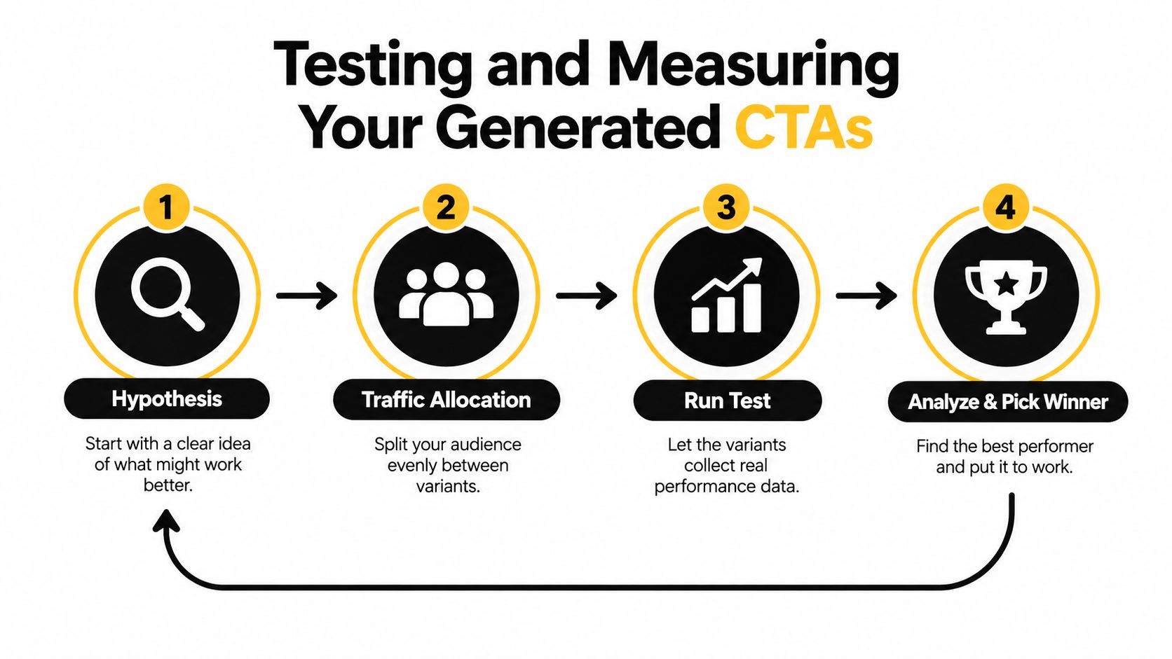
Read the result like an operator
Check whether the lift appears across devices and at least one meaningful audience slice. A desktop win that disappears on mobile may reflect screen context rather than stronger persuasion. Also watch for novelty effects. A new phrase can attract attention initially and then settle once returning visitors see it repeatedly.
A CTA test is invalid if the content above the button changed during the test.
Use an equal split for early learning. Once a clear winner emerges and the routing system supports it safely, a bandit approach can send more traffic toward the stronger option while retaining a comparison path. Don't declare a winner from clicks alone when the CTA changes the quality of leads, trial starts, or purchases.
Integrating Winning CTAs and Next Steps
A winning phrase has value only when it reaches the channels where customers encounter it. Keep the handoff operational:
- Inputs: Save the audience, channel, stage, offer, and objection.
- Generator: Store the prompt and the full variant set.
- Wording: Record which semantic lever changed, such as specificity or risk reversal.
- Testing: Preserve the hypothesis and test conditions.
- Measurement: Connect clicks to the downstream outcome.
- Integration: Publish the approved copy in the right system.
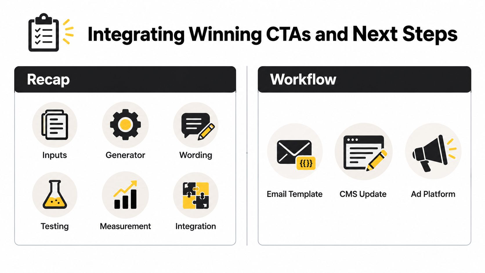
For email, place the approved wording into the ESP template and use merge tags only where personalization is reliable. Review list segmentation and suppression rules before a larger send. Check sender-authentication and deliverability controls, including DKIM and DMARC hygiene, so increased click activity doesn't distract from basic inbox placement.
For landing pages, update the CMS or design-system component rather than editing isolated buttons that will drift apart. For ads and social, add the approved variants to the creative queue and use UTM-tagged destinations so channel performance remains attributable.
Build a searchable prompt library with the final wording, rejected options, audience notes, and test results. Pair CTA prompts with subject-line and preheader prompts, then refresh variants periodically when performance begins to flatten. Prompt Builder offers model-tuned prompt generation, an optimizer for adding clearer constraints and output formats, reusable templates, a searchable Library, and a Prompt Assistant for testing follow-ups in one workspace. That makes it suitable for storing the CTA workflow alongside other marketing prompts without treating generation as a substitute for measurement.
Prompt Builder can help you turn the CTA workflow into reusable prompts for ads, email, landing pages, and social content, with structured constraints and output formats for iteration. Visit Prompt Builder to create, refine, and organize the prompts behind your next CTA test.